CMAC: Breathing life into a brand
Challenge
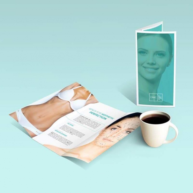
The task required us to brand a medical beauty clinic by the name of City Medical Aesthetic Clinic. The client wanted to reflect a modern look and feel across all branded content. The challenge was to develop a style that reflected the enterprise’s respectability, while doing so in a way that was creative and eye-catching.
Idea
The focus of the design was to metaphorically and visually reflect CMAC. The timeless principle of the golden ratio lent itself to the designing of the brand, with a logo that features the clinic's acronym and the name of the institution encased in a rectangle, using the ratio as a separator. The brand employs a fresh green and white color scheme, to further support the fact that this establishment is one of purity, beauty, and health, and is systematically used across all branded content. The brand identity developed by SPIRIT included the logo-gram, stationary, signage, flyers, and open-house event paraphernalia comprising of invitation cards and the branded content of the event itself.