Le Royal Hotel: Watergate Branding
Challenge
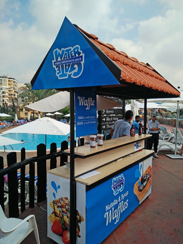
After years from their latest branding procedure, Watergate approached Spirit with a need to re-brand all the outlets of the aqua-park as they were undergoing revamping. The branding elements were plenty and ranged from major uplift of brand identities for F&B outlets to numerous miscellaneous items. The space branding was intended to target all the Waterpark visitors from kids, teenagers to adults. A key challenge was to make the branding lively and kids-friendly without turning it childish and silly, for it to appeal to the different age groups.
Idea
Answering the client’s request Spirit took full power to work on a branding theme to unify the numerous items due to produce. The Watergate park was missing environmental space branding. We designed wayfinding and a fresh communication of identity and information shaping the experiences that connect people to the place. Visually a lively uplift was done were blue was the ruling color. Cursive illustrated droplets of water were also used among most of the items to create a sense of unity in a thrilling and fun way! The splashing water droplets in different sizes and implementations reflected the dynamic feel we wanted to transmit. We opted for a modern and bold font to communicate the different messages on the different mediums in a striking pronounced way. The branding items count to around a 100 element that was perfectly designed and installed within and around the massive property.