MAB: Rebranding
Challenge
Carrying more than five decades of generational expertise and being importers for the foremost Italian brands in the fields of woodworking, aluminum, and iron machineries in addition to garage equipment. MAB wanted to revamp their brand identity and the challenge was to come up with an eye-catching logo that would stick into people’s minds; one that would be used for years to come.
Idea
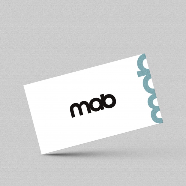
A new identity was developed for MAB through a brand-new minimal logo and a modern stationery giving the brand the ultimate advantage of professionalism. The bold sans serif font used for the logo communicates a neat yet a timeless corporate look and feel with a chic twist portraying the brand’s years of expertise and development.